Front
Back Option 1
Back Option 2

Front

Back Option 1

Back Option 2


I’ve worked with colors before. Everyone has worked with colors to a certain extent. We’ve all put together colors to see what goes well with what, and what we colors we intuitively feel help to tell our story.
So with this project, rather than relying on intuition, I wanted to take some of the mathematical color theory that we learned about last class and apply it here. so I set up a series of adjustment layers in Photoshop that, given a certain input, would automatically generate one new complementary color and three highlight colors that form a triad
The complementary color was set to be a 180° difference from the main color, making its complement. The first of the highlight triad was set to be analagous from the original at 35° hue separation. The other two were set at 120° from that one, forming the triad. Brightness and saturation are consistent through all of the colors.

Great, now we just need to pick a solid starting place.

Enh, not quite….

Whoa, that’s weird. Something to keep in mind for a future project, but not what I’m looking for here.

Hey, that looks pretty good. I dig it. Now to cut it up into some fun patterns and paste it onto some pictures that I took on a backpacking trip last summer -


And add some color…


Looks pretty solid to me.
*side note - I have no idea how to use Instagram. I tried.


New York can be a complicated city to get around in, especially if you’re visiting for the first time. Travelers are required to navigate busy train stations to get to their trains, some of which are local, some of which are express, and some of which take you in a completely different direction than where you want to go. Given this, I was pleasantly surprised the first time I came to visit that I didn’t have too much trouble getting where I needed to go. Simple, color-coded train labels with sans-serif fonts really did help, and there were some little touches too like the one posted below.

Most of the complicated pedestrian areas (malls, airports, etc) that I’ve been in will give you one arrow guiding to your destination, followed by another one at the next turning point, trusting that you’ll be able to follow the trail of breadcrumbs that they’ve laid out. This sign in Union Station, however, goes an extra step just by letting you know that, while the path to the L train starts in the same direction as the NQRW, the L is actually two floors down. It’s a small thing, but without it I could imagine getting confused as to why I saw the NQRW trains going by but no sign of the L.
I started coming here regularly around 2010, and wayfinding around the city has largely been improved since then, thanks in large part to video display technology.

This, I think, is a great example of how new technology can be used very effectively. Sometimes taking this train saves me a little bit of time, sometimes it’s faster just to walk to Union Station. Thanks to the display out front, I no longer need to go into the station to see if it’s worthwhile. I can take a quick glance at the schedule and make my decision while hardly even pausing to think about it.
Of course, not all the changes in design brought about by video technology are good changes.

Here are two LCD displays at my local subway stop. One side has up-to-date train information, and one side is just a still image New York’s famous subway map. It looks fine from a distance, but up close –

While this map isn’t impossible to read, it isn’t exactly easy, either. To fix the situation, I would suggest using a display with a much higher resolution –

The resolution on the printed sign is much better than whatever it is on the TV. If the content being displayed doesn’t need to change or react to anything (this display never changed), then I don’t see any reason not to use a physical sign. Just because one solution is more high-tech doesn’t mean it’s the right one.
I noticed this set of signs outside of a store in Manhattan –

I have to assume that the owner of this place put up three signs in a column so that people would take the warning seriously. Unfortunately, the message of the sign is delivered three times in the same way, so I don’t think it’s as effective as it could be (especially for those who don’t speak English). To help clarify things and to really help maximize the impact of the sign, I combined all three into one and added some easy-to-understand imagery.

I think that’s a little harder to miss.
This is the single most effective piece of design I’ve ever encountered.

Ok, that’s probably not exactly true, but the effect of this design was shockingly direct in a way that I can’t say for any other piece of design. It actually got me to buy a book based on nothing other than its cover. So, let’s take a look at how this happened.
First off, we can look at this in a simpler context. What does it look like when it’s not slanted?

Ok, that’s a little easier to analyze. It’s got a pretty straight forward design that really closely sticks to the fundamentals of design of clarity, consistency and simplicity. The image really only has one object of note inside of it – a man falling from a presumably high place. This photo could have been staged in a busy street with complex buildings. Instead, we see clean gray walls and an empty street. Even the guy’s clothes are in a clean grayscale.

It uses a very simple system of three horizontal sections with margins on the sides and on the top and bottom.

The falling man is placed slightly below center.

The color scheme is a range from pale beige to black, again helping to keep the whole image simple.
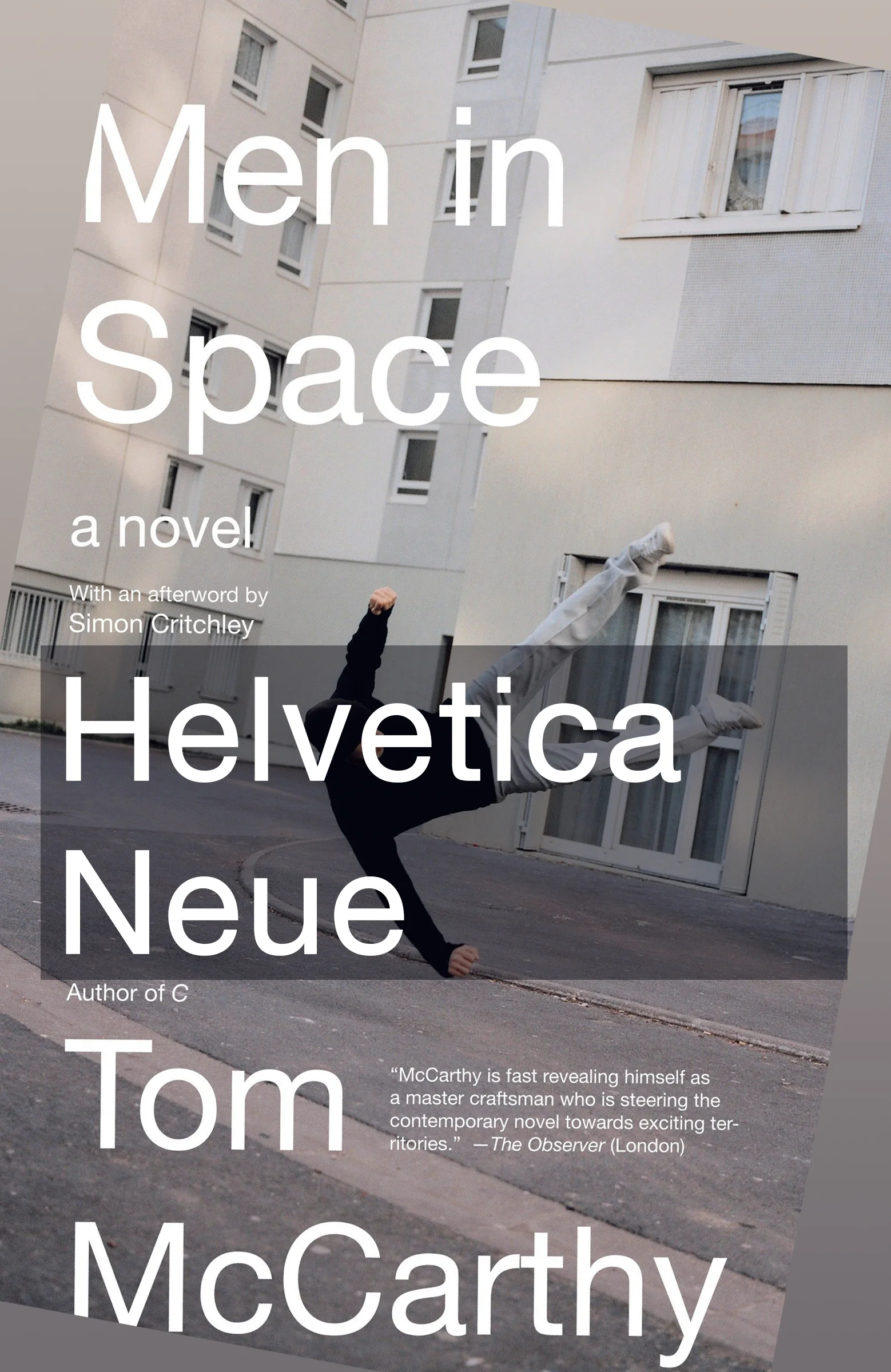
Typeface is entirely written in Helvetica Neue, which also keeps the whole thing looking clean.

And, lastly, we have the final touch where the design changes from being just simple and clean to something truly clever. The entire system is rotated by about -10 degrees. Now the street forms a clean horizontal line across the cover, and the text is crooked so that it perfectly lines up with the falling man, but not the lines of the book. In effect, we have two separate reference frames clashing with each other. Thus, with one simple move, we now have a design that is both visually intriguing and apt for the themes of the book, which revolve around differing perspectives happening in the same place.